Why Font Choice Matters for Laser Cutting
Choosing the right font for laser cutting is more important than many realize. Fonts affect not just how your design looks but also how well it holds up after cutting. Readability is key—fonts with clear, bold letters make your message easy to see and understand. At the same time, the font’s structure impacts durability. Thin lines and delicate details can easily break or warp during cutting, especially depending on the material you use, like wood, metal, or acrylic.
Aesthetics matter too. The font sets the tone for your project, whether it’s sleek and modern or ornate and classic. But laser cutters have limitations that must be considered. Thin strokes and tight letter spacing might look good on screen, but they can cause fragile cuts or missing parts when actually cut. Material specifics affect this—wood may char or splinter, metal requires different settings, and acrylic needs clean, smooth edges.
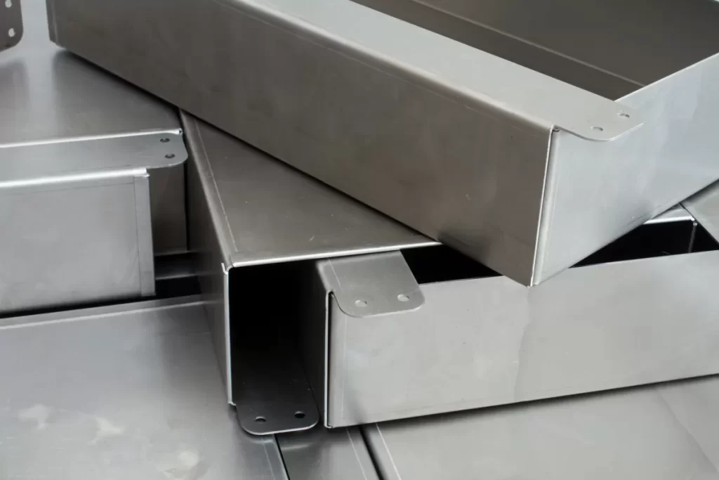
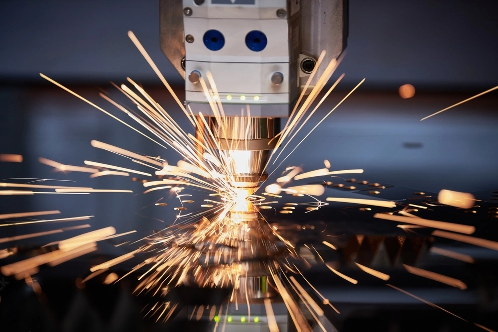
That’s where HYCNC comes in. With years of experience and advanced CNC laser cutting technology, HYCNC understands these challenges and ensures every project meets the highest quality standards. Our expertise helps you pick fonts that balance style, readability, and durability for stunning laser cut results every time.
Key Characteristics of Laser Cutting Friendly Fonts
When picking fonts for laser cutting, certain features make the process smoother and the results better. Here’s what to look for:
-
Bold, Even Stroke Widths: Fonts with thick, consistent lines hold up better during cutting. Thin or uneven strokes can warp or break, especially on delicate materials.
-
Good Letter Spacing and Kerning: Proper spacing between letters ensures the cuts stay clean and letters don’t merge or break apart. Tight spacing can cause problems in the cutting process.
-
Stencil or Bridged Designs: For letters with closed loops like A, B, O, fonts that include built-in bridges or stencils prevent small pieces from falling out. This keeps your design intact without extra work.
-
Vector Software Compatibility: Choose fonts that work well with vector-based software like Inkscape or LightBurn. This lets you easily convert text into paths for precise CNC cutting.
-
Material Considerations: Different materials—wood, metal, acrylic—require different font styles and thicknesses. For example, acrylic needs bolder fonts to avoid chipping, while wood allows for more detail.
With these characteristics, your laser cut fonts will be durable, readable, and visually appealing across various projects.
Top 10 Fonts for Laser Cutting with Descriptions
Choosing the right font can make or break your laser cutting project. Here are 10 great fonts that work well with laser cutting, along with what they’re best for, material compatibility, and where to find them.
1. Arial Black
Bold, sans serif with consistent stroke thickness. Perfect for signage and engraving on wood, acrylic, and metal. It’s a free font available on Google Fonts, easy to use across various laser cutting software.
2. Verdana
Clean and readable with good letter spacing. Versatile for multiple materials like wood and acrylic. It’s free and commonly found on most systems, making it ideal for everyday projects.
3. Impact
Bold sans serif designed to catch attention. Great for eye-catching designs on thicker materials. It’s a paid font but widely available and works well for large-scale cuts.
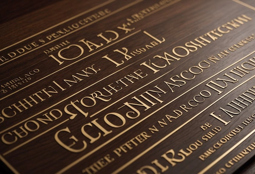
4. Bree Serif
A thick serif font that adds an elegant, sophisticated look. Best suited for wood and acrylic. Bree Serif is a paid font but worth it if you want that classy finish.
5. Stencil
Built-in bridges in letters like A, B, and O prevent pieces from falling out. Ideal for industrial signs and stencil projects on metal or wood. This font is typically free and easy to find.
6. Futura
Modern, geometric, and clean. Works well for contemporary aesthetics and signs on acrylic and metal. Futura is paid but popular among designers for its sleek look.
7. Lexend Semi Bold
Wide letter spacing improves small text legibility, perfect for delicate cuts or thin materials like wood veneers. Available free on Google Fonts, making it budget-friendly.
8. Barlow Condensed
Tight, bold, and easy to bridge, which means sturdier letters after cutting. Works well on metal and wood. Free for use via Google Fonts, great for durable designs.
9. Helvetica
A classic, clean, and professional font. Very versatile across materials and project types, suitable for signage, branding, and more. Paid but worth the cost for high-quality results.
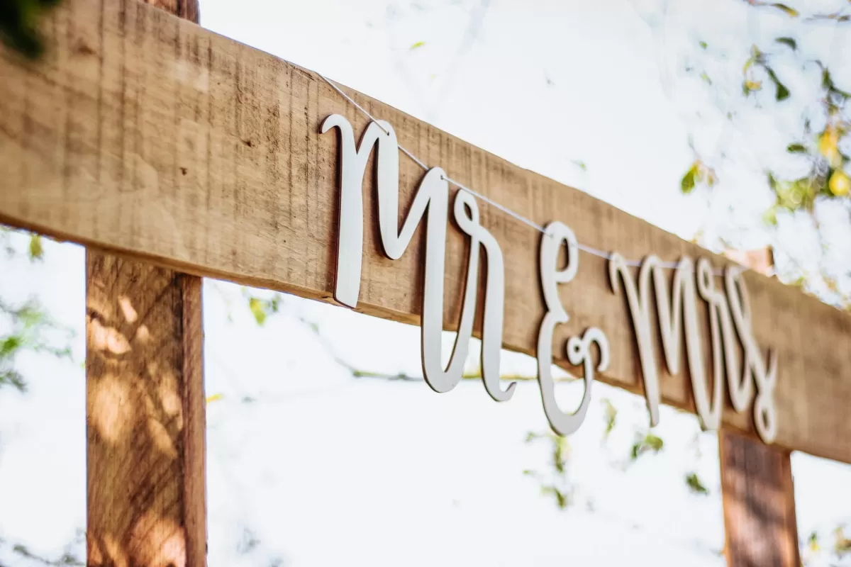
10. Phudu
A handwritten style with thick strokes, great for decorative cuts and personalized signs. Works best on acrylic and wood. This one is usually free on platforms like FontSpace.
Most of these fonts are compatible with vector-based laser cutting software such as Inkscape and LightBurn. You can find free options easily on Google Fonts or FontSpace, while some paid fonts are available on sites like Adobe Fonts or MyFonts. Picking fonts that combine readability, durability, and style ensures your laser cut projects come out clean and professional every time.
Expert Tips for Optimizing Fonts in Laser Cutting
To get the best results with laser cutting fonts, here are some practical tips to keep in mind:
- Convert fonts to vector paths before sending your design to CNC software like LightBurn or Inkscape. This avoids compatibility issues and ensures the laser follows the exact shape.
- Use bridging techniques on fonts that aren’t stencil-style. Adding small bridges keeps enclosed areas like the inside of an “O” or “A” from falling out during cutting.
- Adjust stroke width and kerning in your design software. Thicker strokes help prevent fragile cuts, and proper spacing (kerning) avoids letters melting together.
- Test your fonts on scrap material first. Trying a sample cut saves material and time by catching issues early.
- Pick fonts based on material thickness. For thinner materials like acrylic or thin wood, choose bolder fonts to prevent warping or breakage.
- Use HYCNC’s design consultation services if your project is tricky or needs custom tweaks. Our team can optimize fonts and designs for top-quality laser cuts.
Following these steps helps make sure your laser cutting fonts come out clean, durable, and visually sharp every time.
Common Font Related Mistakes to Avoid
When picking fonts for laser cutting, watch out for these common mistakes:
- Using thin or intricate fonts: Thin lines or fancy details often break or warp during cutting, especially on delicate materials.
- Ignoring material differences: Wood, metal, and acrylic behave differently. A font that works well on wood might fail on metal if you don’t adjust for the material.
- Not converting fonts to vectors: Skipping this step can cause errors in your CNC software, leading to messy cuts or failed jobs.
- Overlooking kerning and spacing: Poor letter spacing makes text hard to read and can cause parts of letters to fall out after cutting.
Avoiding these errors will save time and ensure your laser cutting projects look sharp and last long.
How HYCNC Enhances Your Laser Cutting Projects
At HYCNC, we use state-of-the-art CNC laser cutting technology to deliver precise, high-quality results every time. Whether you need custom designs or help optimizing fonts for your project, our team is ready to support you. We understand how important font choice and design details are for clean, durable cuts in materials like wood, metal, and acrylic.
Our experts work closely with you to ensure your fonts and designs translate perfectly from digital files to final products. This includes advising on font thickness, spacing, and stencil features to avoid common cutting issues. If you’re unsure about your design, HYCNC offers personalized consultations to get everything just right.
Ready to get started? Contact HYCNC today for a quote or a design consultation to make your laser cutting project stand out with professional precision and reliability.
FAQs About Fonts for Laser Cutting
What are the best free fonts for laser cutting?
Some of the best free fonts include Arial Black, Verdana, Stencil, and Futura. You can find these on Google Fonts or FontSpace. They’re bold and simple enough for clean cuts, which works well for most materials.
Can script fonts be used for laser cutting?
Script fonts can be tricky because they often have thin lines and close spacing, which can cause breaks or fragile cuts. If you want to use them, make sure the strokes are thick enough and convert them to vector paths with added bridges to keep parts connected.
How do I convert fonts to vector paths?
In software like Inkscape or LightBurn, select your text and use the “Convert to Path” or “Create Outlines” option. This turns your font into shapes the laser cutter can read, avoiding errors during the cutting process.
What fonts work best for specific materials like acrylic or wood?
For acrylic, use bold fonts with even stroke widths like Arial Black or Impact; they handle the clean edges well. For wood, fonts with slightly thicker and less intricate details work best, such as Bree Serif or Barlow Condensed, to avoid burning or fragile cuts.
How does HYCNC ensure precision in laser cut text?
HYCNC uses state-of-the-art CNC laser cutting technology paired with expertise in font optimization. We double-check vector files for clean paths, adjust designs based on material, and run test cuts to ensure every letter is sharp and durable. Our team also offers design consultations to help you pick the right fonts and settings for your project.
Have questions? Contact us anytime to get help with your font selection and laser cutting needs.